Digikodi
Hardware Device

PROJECT OVERVIEW
Digikodi tackles the challenges associated with traditional rent collection methods, often plagued by inefficiencies and potential security risks. This innovative device offers a secure and user-friendly platform for:
Effortless Rent Collection - Landlords can ditch the stress of chasing rent payments. Digikodi's real-time connectivity ensures timely payments and allows tenants to pay electronically through various convenient channels, eliminating the need for cash transactions.
Streamlined Service Management -From plumbing repairs to security checks, Digikodi empowers tenants to request and schedule essential household services directly through the device. The user-friendly interface makes the process effortless and eliminates the need for multiple phone calls or emails
Exploring the problem
Traditional rent collection methods in Kenya often involve:
Inconvenient cash transactions
Difficulty for landlords to track payments and manage late fees
Limited communication channels for tenants to request repairs or services
Design Process
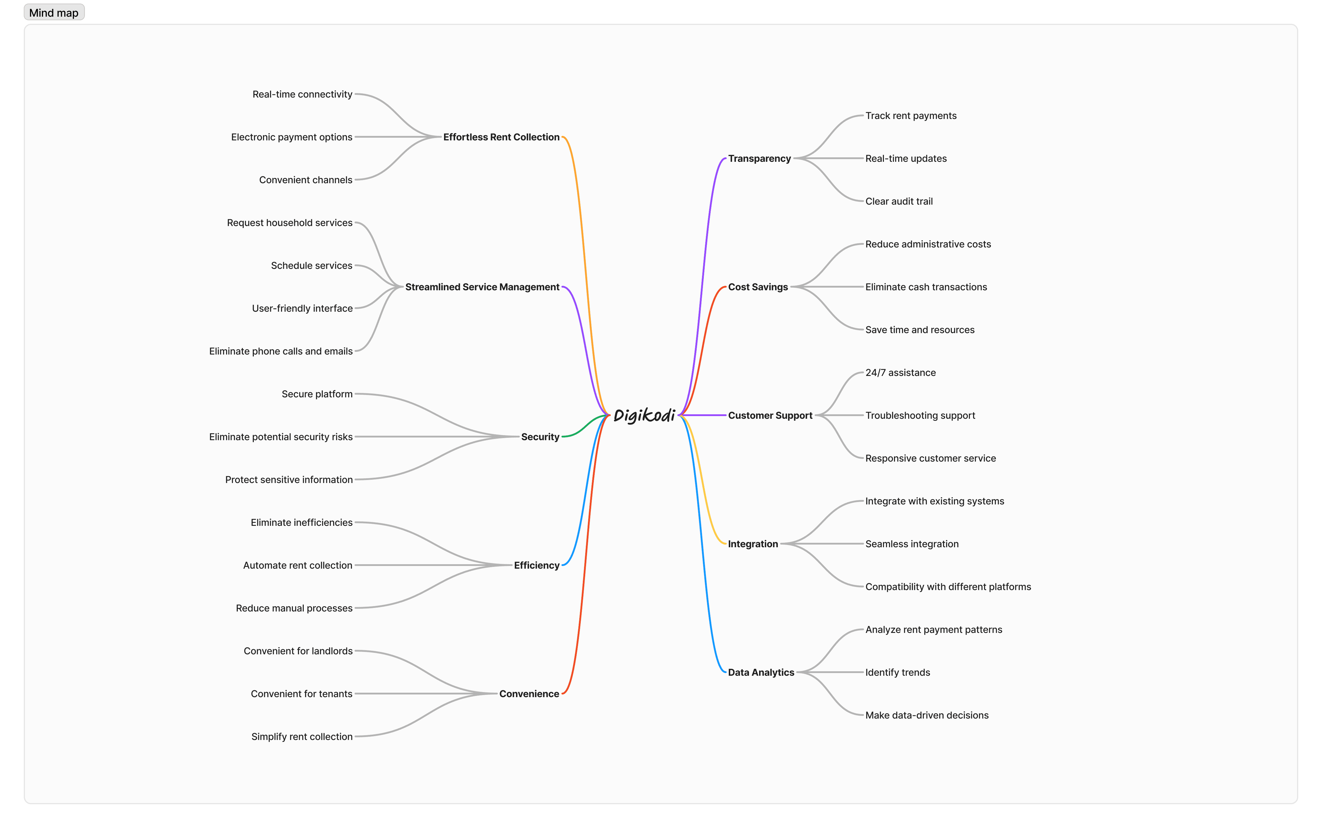
Digikodi Mind Map
When I joined the DigiKodi project halfway through the initial discussions, I realized there were differing perspectives on the problem statement from the user's point of view. This created some confusion and highlighted the need for a clear, unified understanding of the issues we aimed to address.
some team members believed that the problem we were solving with onboarding technicians on the platform was that landlords were paying technicians on a monthly retainer, often with little to no maintenance or services actually performed
Others thought the issue was for clients who had to find and pay their own technicians, which was time-consuming and inefficient.
As I got acquainted with the project, it became clear that more research was needed to accurately define the problem and ensure we were addressing the right user needs. Convincing the team of this necessity was a challenge, but it was crucial for the project's success.
To comprehensively understand and organize my thoughts on the development of the DigiKodi device, I created a detailed mind map. This mind map serves as a visual tool to capture and connect all relevant aspects of the project, including user needs, key features, design iterations, and future developments. By mapping out these elements, I was able to identify relationships, prioritize tasks, and ensure a cohesive and user-centric approach to building the device. The mind map played a crucial role in guiding my design process and aligning my efforts towards creating an effective and user-friendly solution for property management and tenant support.
User flow
Here's a user flow that illustrates the steps involved for tenants to effortlessly pay rent directly through the Digikodi device. This flow starts from login and progresses all the way to receiving confirmation of a successful transaction.

Wireframes
With these user flows in mind, we began to visualize beyond the MVP stage by wireframing extensively. The challenge was to see how to maximize on the screen size given it is a bit small, 320 x 480 pixels. These initial sketches served as a springboard for further discussion and refinement.

User Interface Designs
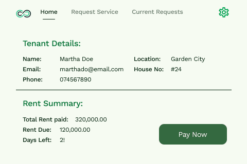
Home page
The home page focuses on rent payment details, providing clear and concise information about upcoming payments and outstanding balances
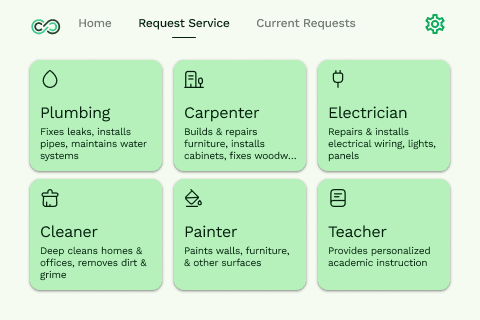
Request Services
This dedicated page showcases the services offered through the Digikodi platform.
Usability Testing
Initial design work focused on a landscape version. However, usability testing revealed several key insights that necessitated significant changes.
Preference for Portrait Mode
Users preferred a portrait orientation, as it aligns with how they typically use their phones.
Iconography and Information Density
Given the small screen size, incorporating icons was essential to efficiently display more information on each page.
Readability at a Distance
Most users would interact with the device from an arm's length when it was mounted on the wall. Therefore, we enlarged the font size and reduced content on the home screen to highlight rent payment details as the primary focus.
Evolving Design Style Guide
The design style guide underwent revisions to better align with the final user interface requirements and ensure a cohesive user experience.
Design Iterations
Rent Details page V1

Rent Details page V2
Request Services page V1

Request Services page V2
Next Steps
As DigiKodi continues to evolve, our next steps focus on developing a comprehensive dashboard management system for both the device and property managers. This system aims to enhance functionality and provide better control and insights for users and administrators